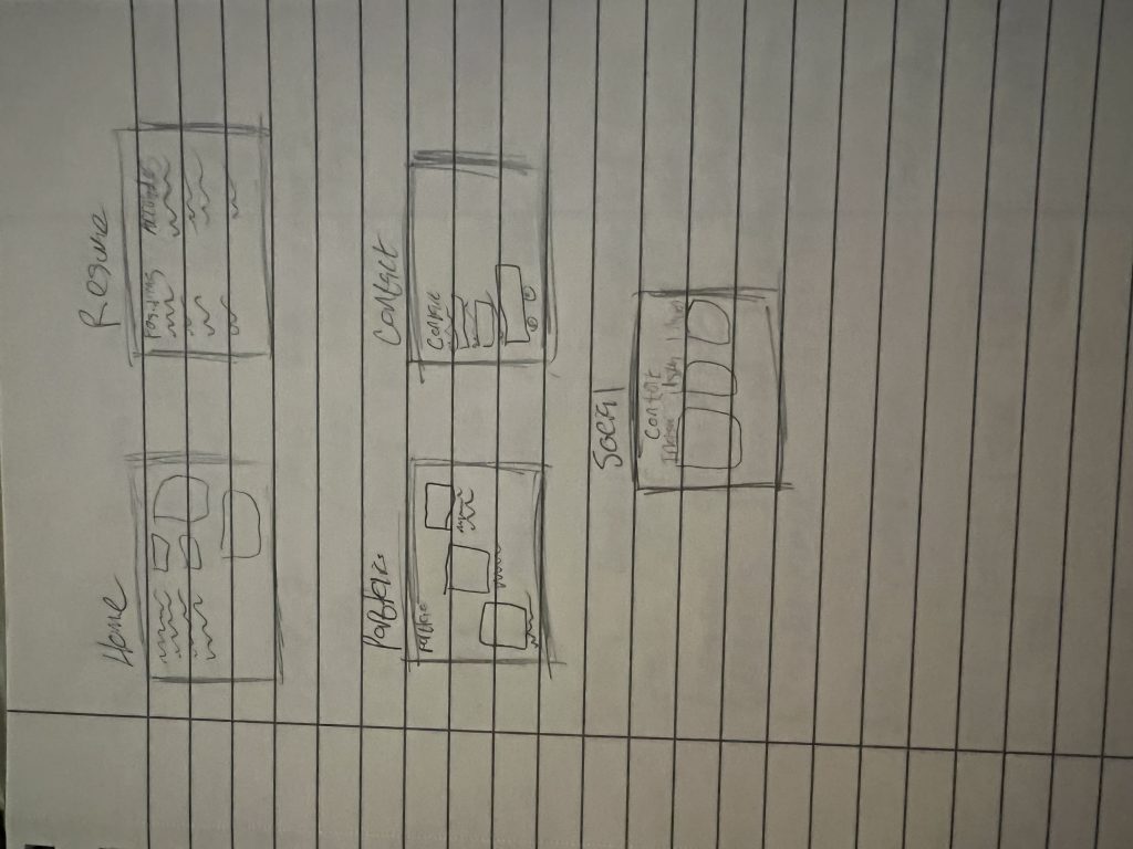
https://www.figma.com/file/0F80E0wJOLKnv2zQMtEkbs/Shane-McDonough-Website?node-id=0%3A1
I greatly enjoyed this project on web design. I learned a lot about using figma and had a great time using this service. Mainly using the prototype tool to add hyperlinks and make it so my pages can be reached through my header. That was a lot of fun figuring out and learning how to do that. This project was pretty easy for me as a whole, just because I had done 2 projects like this in high school. Those projects gave me a good fundamental understanding of this project but I still learned a lot. The most challenging thing was formatting my images in some scenarios and then just picking my color scheme. I wanted my colors to work well with each other and for my images to make sense. I think the one thing I would change about my submission would just be my logo from lab 3. I wish it looked cleaner and would relate more to my website as a whole stylistically. The professor could improve just by adding more class time for this project for questions. There were a few classes where I would’ve appreciated even just a 10-minute period of time to just ask some formatting questions. Websites are a great tool so I think I will be using the skills learned in this project for years to come. Whether it is making websites for work or just trying to create my portfolio through this. I read an article posted by HubSpot(Linked below) for some inspiration and a guide for my homepage. I have experience using HubSpot for SEO work so I clicked on this link since I know somewhat about the organization.
https://designers.hubspot.com/blog/15-examples-of-homepage-design